When the Heat Dome Reached the Salish Sea
In late June 2021, a historic heat dome pushed Pacific Northwest air temperatures past 40 °C. This is what it did to the water underneath — traced entirely inside OceanECO, point by point, from the hindcast model and a real mooring's own sensor record.
The spike at the surface
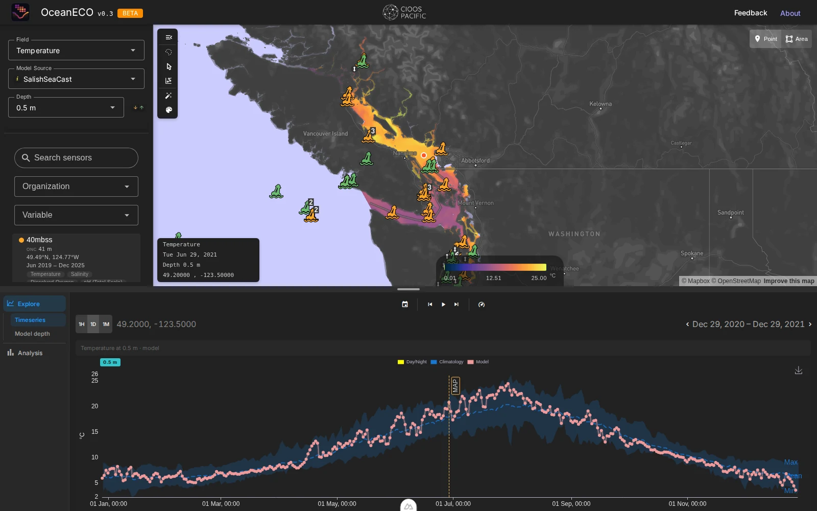
Two weeks tell the whole story. Pick a point in the central Strait of Georgia, set the depth to the surface, and watch the daily model line climb through the top of its own climatology.
OceanECO always plots a variable against its own history — a shaded band running from the historical minimum to maximum for that day of year, with the long‑term mean dashed through the middle. On June 12, 2021, surface temperature at this point was an unremarkable 14.5 °C. Seventeen days later it was 20.9 °C. A week after that, 22.1 °C. The model line doesn't just rise — for most of July it sits above the shaded “Max” band entirely, which is the chart's plain-language way of saying: this hadn't happened before in the record it's comparing against.
Thirty-three days above threshold
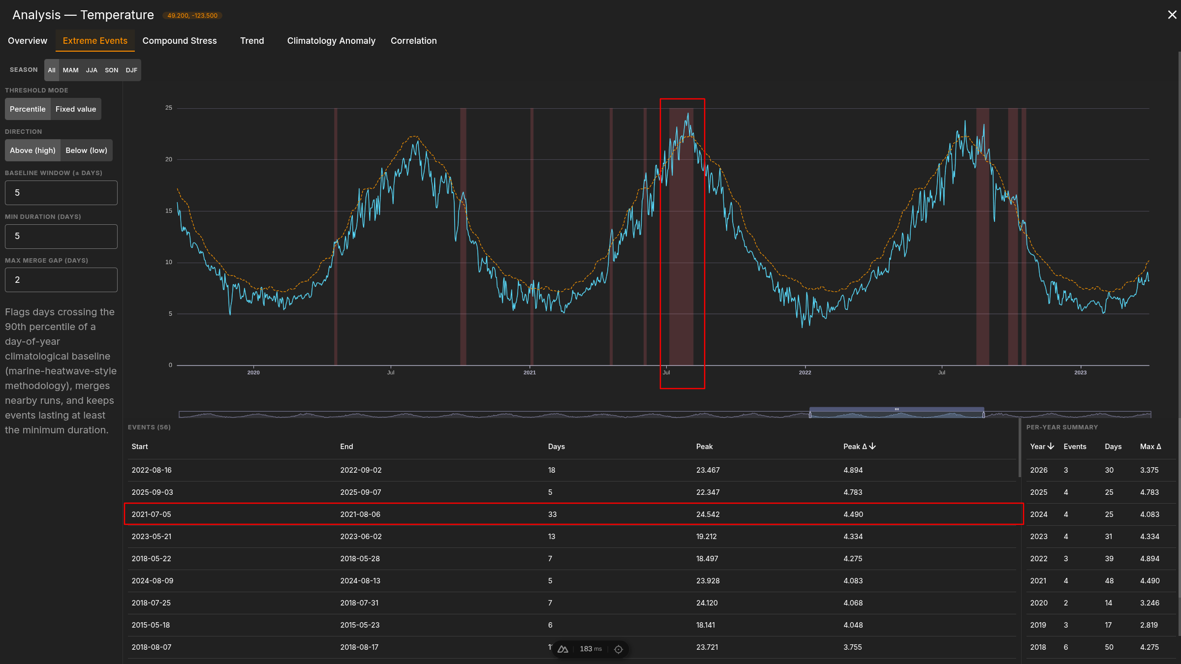
The same point's full record, run through a marine-heatwave detector, without telling it where to look.
OceanECO's Extreme Events tool flags any run of days crossing the 90th percentile of a day-of-year climatological baseline — the standard marine‑heatwave definition — then merges nearby runs and discards anything shorter than five days. Pointed at this location's full 2007–2026 daily record with no hints about 2021, it independently surfaces a run from July 5 to August 6, 2021: 33 days, peaking at 24.5 °C, 4.5 °C above baseline. The per‑year tally on the right puts 2021 at 4 events and 48 heatwave-days total — a lot, but not even the single worst year at this point: 2022 edges it out with a higher peak anomaly (+4.89 °C), a reminder that the tool is reporting what the record actually contains rather than confirming a story picked in advance.
How deep did it go
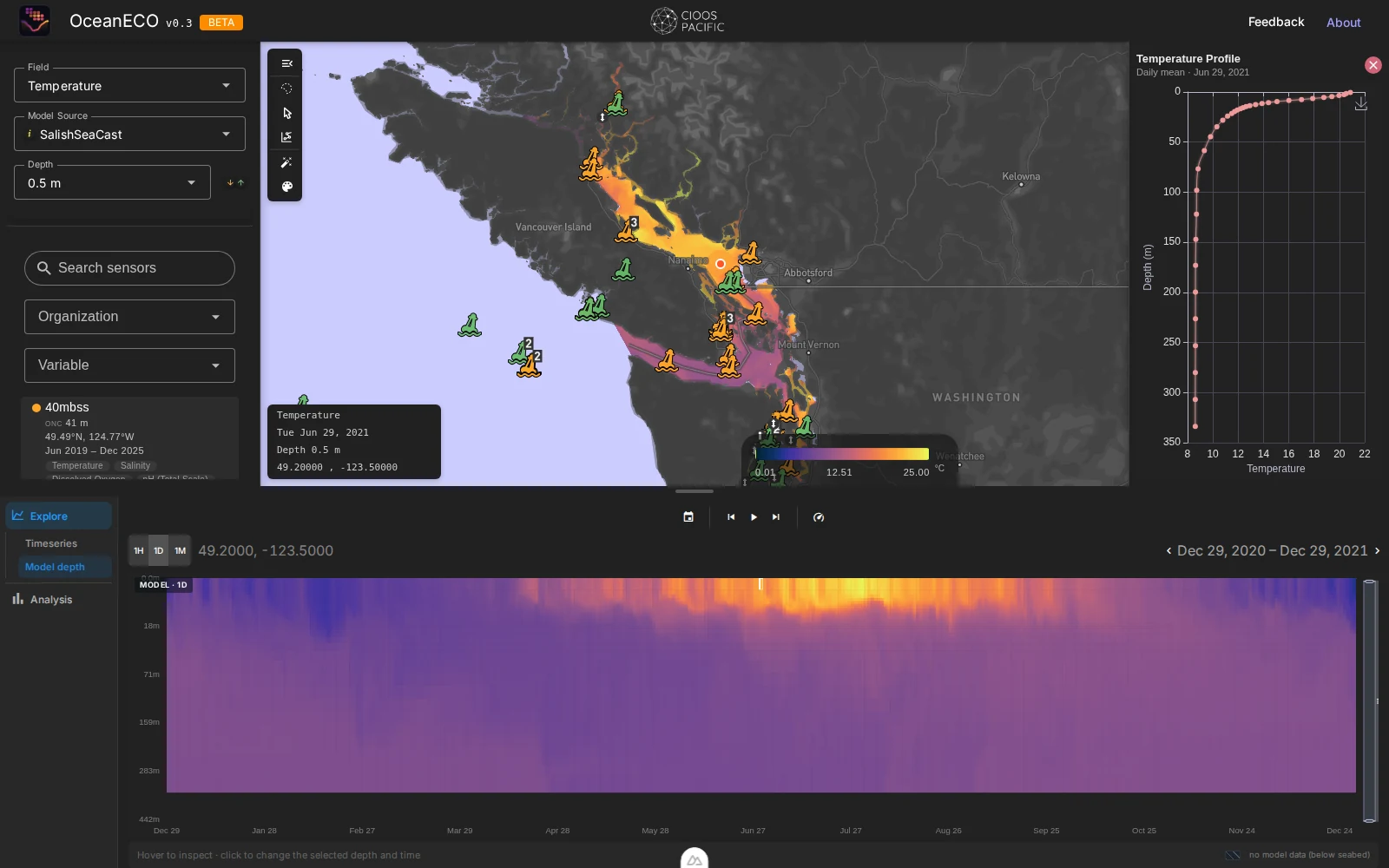
The Hovmöller view answers a question the surface chart can't: did the rest of the water column feel this at all?
Switching to Model depth trades the single-depth line for the whole water column at this point across a year — depth down, time across, colour for the variable. The temperature panel makes the answer obvious at a glance: the bright band is a thin skin, confined to roughly the top 20 metres, sitting on top of water that stays cold and essentially unmoved year‑round. Click June 29 and the companion depth profile on the right draws the same story as a single curve: about 21 °C at the surface, collapsing to 9 °C by 100 metres — strong, heatwave‑driven stratification, not a water‑column‑wide warming event.
Swap the field to Omega Aragonite and the picture changes character rather than just colour. The saturation state is visibly patchier and noisier than temperature — carbonate chemistry doesn't track heat in lockstep — and below about 20 metres the water sits undersaturated (Ω < 1, corrosive to aragonite shells) for most of the year regardless of what the surface is doing. The heat dome was a surface event; the Salish Sea's deeper acidification problem is a standing one.

Warm and corrosive, at once
A single threshold rarely tells the whole ecological story. Compound Stress asks for two at a time.
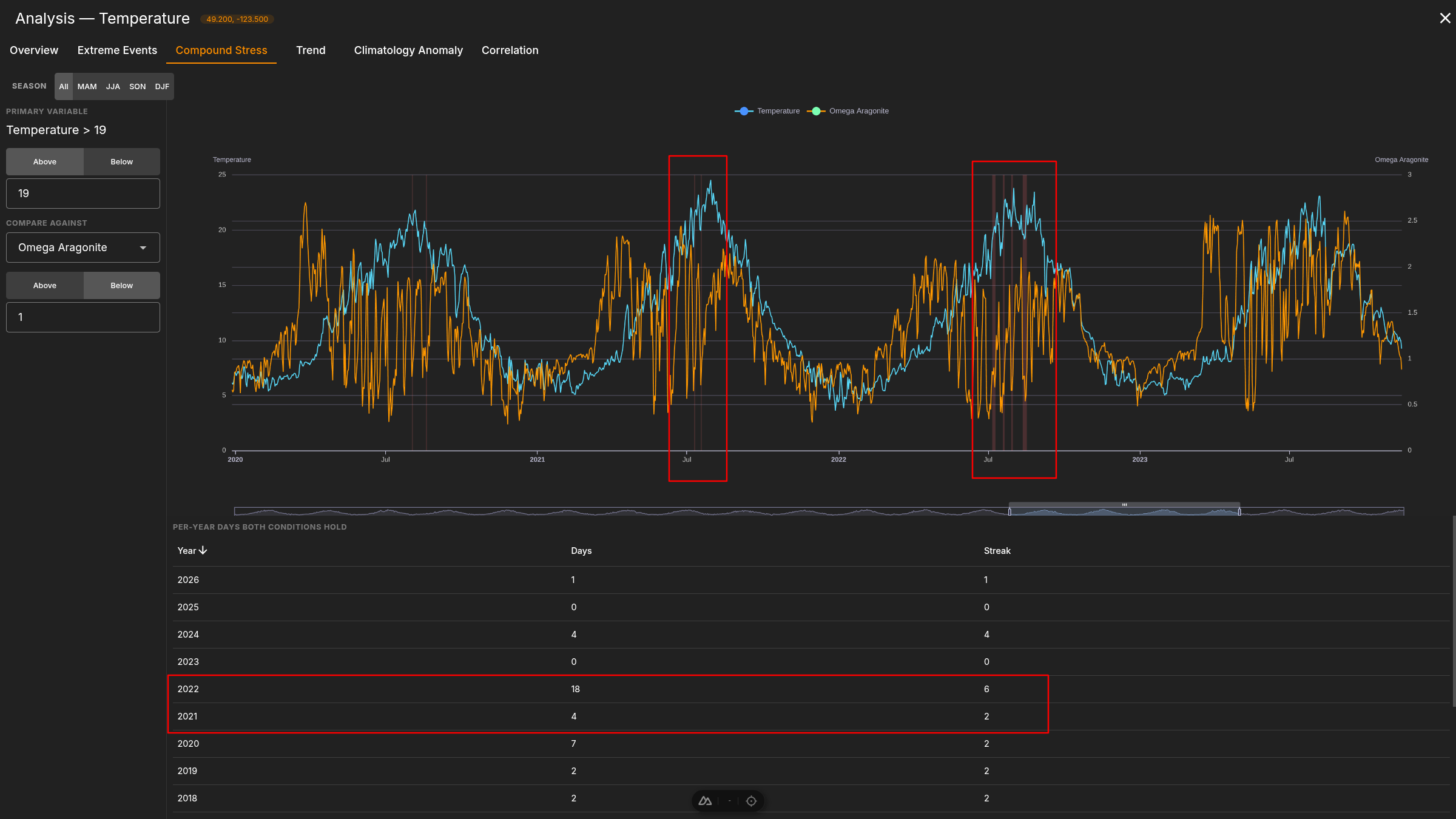
Set a joint condition — Temperature above 19 °C and Omega Aragonite below 1 on the same day — and OceanECO counts, per year, how often both held at once. In 2021 that's a comparatively modest 4 days, in a longest streak of 2. 2022 is the standout year on this particular pairing, with 18 days and a 6‑day streak — a useful check against assuming the year with the biggest heat anomaly must also be the year of worst compound stress. It usually isn't the same year twice.
The long view
Zoomed out to nineteen years, 2021 stops looking singular and starts looking like a data point in a widening spread.
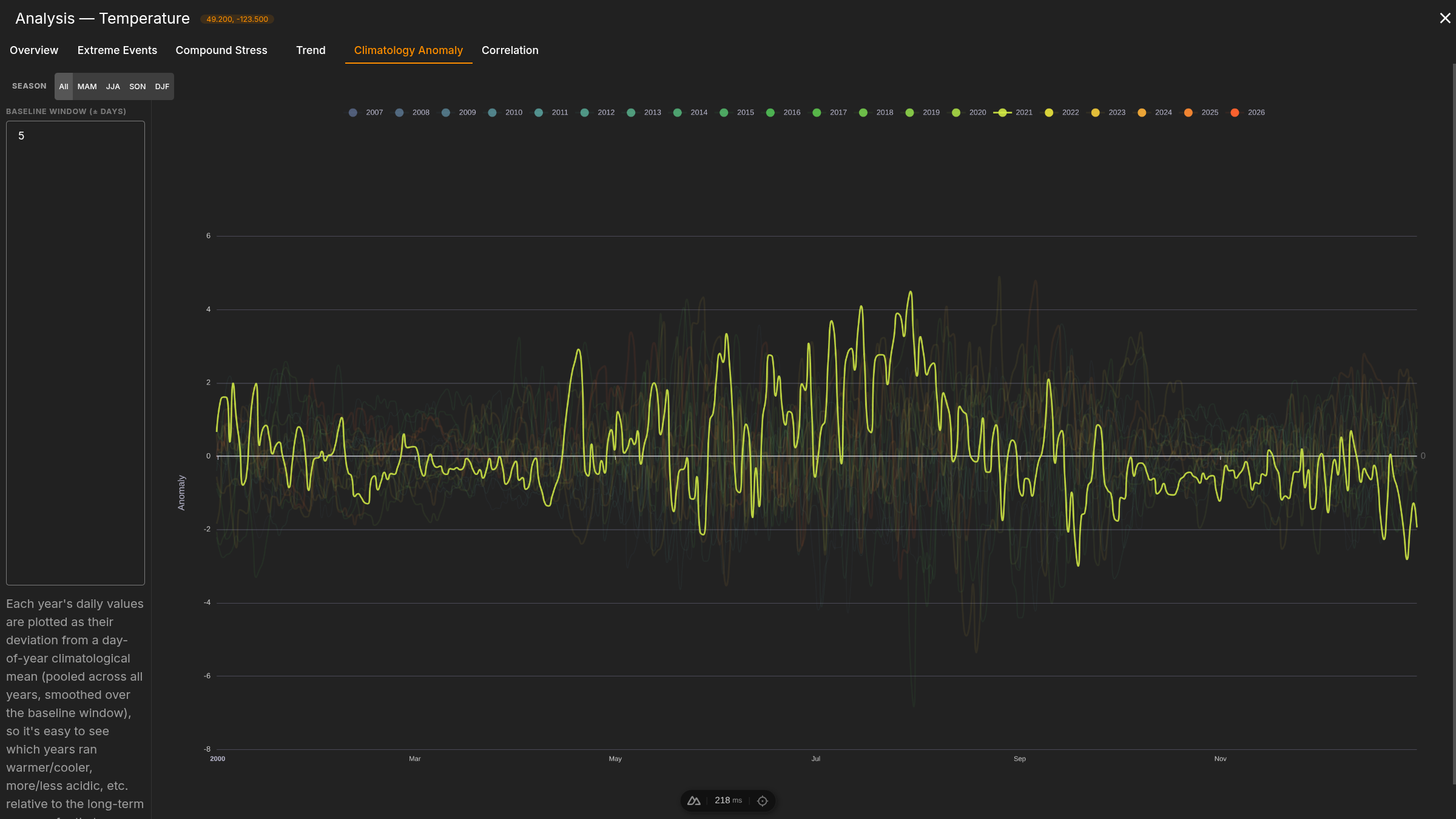
Climatology Anomaly re-plots every year's daily values as a deviation from the pooled day-of-year mean, all overlaid on one synthetic calendar. What jumps out isn't just 2021's summer excursions past +3 °C — it's how many other years, especially from the mid-2010s onward, reach into the same territory. The heat dome was extreme, but the chart it shows up on is one this location has been filling in with warmer and more erratic summers for a while.
Does the water agree with the model?
A hindcast is only as useful as its agreement with something that was actually moored in the water. So we asked one.
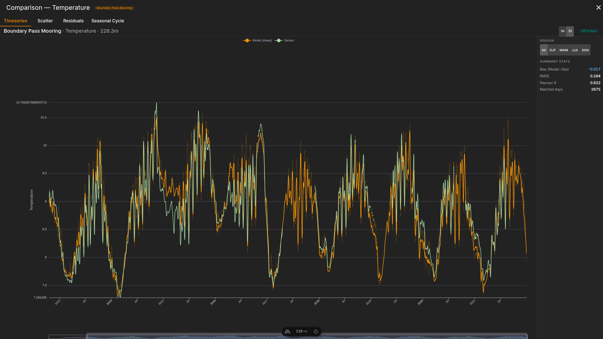
ONC's Boundary Pass Mooring sat at 223 metres depth from October 2012 to August 2021, logging temperature the entire time — including straight through the 2021 heat dome. OceanECO's Comparison workspace lines its record up against the model at the matched depth: bias −0.017 °C, RMSE 0.284 °C, Pearson r 0.922 across 2,675 matched days. Model and sensor track each other closely for the whole record — and both stay flat between roughly 7 and 11 °C straight through the summer of 2021. At 223 metres, an instrument that was actually there confirms what the model already said: the heat dome never reached it.